5 Things the Mercator Map Gets Wrong
Kort samengevat
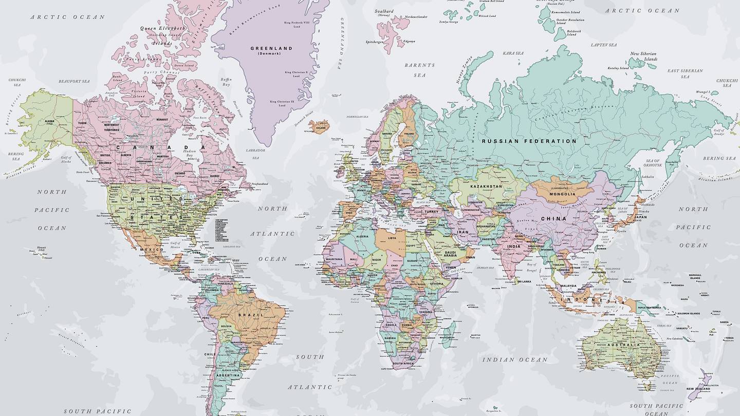
The Mercator map, which most of us grew up with, makes Africa look smaller and Greenland much larger than they are—but that's just the tip of the iceberg.
Verder lezen bij de bron
Bekijk het volledige nieuwsbericht rechtstreeks bij Mental Floss.
Lees het volledige bericht ↗